html,css总结,长期更新
css书写方式4种
-
style
1 <style></style> -
link 外链式
1 <link rel="stylesheet" href="xxx.css"> -
导入式
最不常见
不等待css加载完毕,而是立即渲染html,所以页面会有素面朝天的时间
1<style> 2 @import url(css/css.css); 3</style> -
行内式
只给一个标签使用,牺牲批量设置能力
1<h2 style="color:red;">
display
改变元素的特性
inline-block;inline;block
1  <!-- h1/p/div/span/a/img -->
2  <!-- HTML考虑一个问题: 每个元素在页面当中到底占据多大的空间 -->
3  <!-- 某些元素非常重要: 独占一行 -> 类型: 块级元素(block level): h元素/p/div -->
4  <!-- 某些元素属于内容的一部分: 没有必要独占一行, 其他内容在同一行显示
5                              -> 类型: 行内级元素(inline level)
6                              -> span/a/img/strong/i
7  -->
text-align
文本居中
1.xx{
2  text-align: center;
3}
块级元素里 ,对文本 和图片都有效。
块级套块级,里面块级剧中
1.xx{
2  margin: 0 auto;
3}
字体
font-size
1.box{
2  font-size:12px;
3  font-size:2em; /*针对父级2的倍*/
4  font-size: 200%; /*针对父级2的倍*/
5}
font-family
从左边到右边适配找。找到则停止。
1body {
2  font-family: "Microsoft YaHei", "Heiti SC", tahoma, arial, "Hiragino Sans GB", "\5B8B\4F53", sans-serif;
3}
font-weight
1.box{
2  font-weight:700;
3  font-weight:bold;  /*700和bold等价*/
4}
line-height
行高,line-height=height 这样文字就是居中
1.box{
2  line-height:100px;
3  height:100px;
4}
font
 1    .box {
 2      /* 关于字体的属性 */
 3      font-size: 30px;
 4      font-weight: 700;
 5      font-variant: small-caps;
 6      font-style: italic;
 7      font-family: serif;
 8      line-height: 30px;
 9
10      /* 缩写属性 */
11      /* 1.5的行高是相对于font-size的 */
12      font: italic small-caps 700 30px/1.5 serif;
13    }
选择器权重
 1<!DOCTYPE html>
 2<html lang="en">
 3<head>
 4  <meta charset="UTF-8">
 5  <meta http-equiv="X-UA-Compatible" content="IE=edge">
 6  <meta name="viewport" content="width=device-width, initial-scale=1.0">
 7  <title>Document</title>
 8  <style>
 9    div.box {
10      color: red !important; /* 10000 */
11    }
12
13    /* id选择器: 100 */
14    #main {
15      color: orange;
16    }
17
18    /* 类选择器: 10 */
19    .box {
20      color: blue;
21    }
22
23    /* 元素选择器: 1 */
24    div {
25      color: purple;
26    }
27
28    /* 通配选择器: 0 */
29    * {
30      color: yellow;
31    }
32  </style>
33</head>
34<body>
35
36  <!-- 内联样式: 1000 -->
37  <div id="main" class="box one two" style="color: blue;">我是div元素</div>
38
39</body>
40</html>
定位position
标准流static
默认的,position:static 就是标准流
1    .box {
2      display: inline-block;
3      position: static;
4      /* static  是默认的 下面是无效的  */
5      left: 0;
6      top: 100px;
7      bottom: 20px;
8      right: 30px;
9    }
relative;
relative: 相对定位 , 相对原来的位置(最左上角)
固定定位
相对于视口
position: fixed;
绝对定位
position: absolute;
在没有祖先元素定位的情况下, 相对于的是谁? 视口
祖先定位 未必就是relative,也可以是fixed,absolute.
绝对定位的特点
absolute/fixed 就可以任意设置宽高 ,不在汇报宽高 给 上级元素
fixed 也算是绝对定位,只是她永远是相对于视口,而absolute 她则看祖先有没有定位元素。
z-index
仅对定位元素有效,有position
浮动
float和position一样可以脱离标准流。
特点
-
一旦浮动后,脱离标准流, 定位元素层叠在浮动元素上面
-
不超出包含块的左右边界
-
浮动元素之间不能层叠, 另外一个元素已经在那个位置了,后面的只能紧贴着前一个浮动元素(左浮找左浮,右浮找右浮), 如果水平方向剩余的空间不足,浮动元素将向下移动,直到有足够的空间为止。
-
浮动元素不能和行内级内容层叠,行内级内容将会被浮动元素推出
clear
浮动,不再向父亲元素汇报高度,导致父亲高度塌陷的问题 。如果解决?
清楚浮动。
清楚浮动的目的是让父亲元素计算高度的时候,把浮动子元素也算进去。
- 给父亲增加高度
- 在父亲最后面增加空的元素,clear:both;
- 在父亲增加伪元素
 1    .clear-fix::after{
 2            content: "" ;
 3            clear:both;
 4            display:block;
 5            height:0; /*浏览器兼容性*/
 6            visibility:hidden; /*浏览器兼容性*/
 7    }
 8    .clear-fix{
 9      /* 兼容ie6/ie7 */
10      *zoom: 1;
11    }
flex 布局
开启了 flex 布局的元素叫 flex container
flex container 里面的直接子元素叫做 flex item
当flex container中的子元素变成了flex item时, 具备一下特点:
- flex item的布局将受flex container属性的设置来进行控制和布局;
- flex item不再严格区分块级元素和行内级元素;
- flex item默认情况下是包裹内容的, 但是可以设置宽度和高度;
设置 display 属性为 flex 或者 inline-flex 可以成为 flex container
- flex: flex container 以 block-level 形式存在
- inline-flex: flex container 以 inline-level 形式存在
1display: inline-flex;
2display:flex;
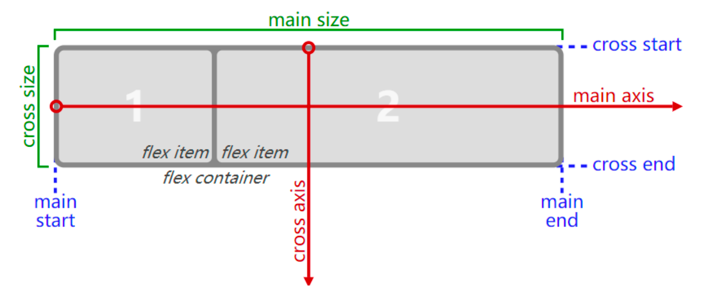
flex布局模型
主轴、交叉轴
flex相关的属性
应用在 flex container 上的 CSS 属性
- flex-flow
- flex-direction
- flex-wrap
- flex-flow
- justify-content
- align-items
- align-content
应用在 flex items 上的 CSS 属性
- flex-grow
- flex-basis
- flex-shrink
- order
- align-self
- flex
flex-direction
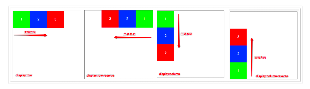
flex items 默认都是沿着 main axis(主轴)从 main start 开始往 main end 方向排布
flex-direction 决定了 main axis 的方向,有 4 个取值
row(默认值)、row-reverse、column、column-reverse
用来修改主轴。
flex-wrap
flex-wrap 决定了 flex container 是单行还是多行
- nowrap(默认):单行
- wrap:多行
- wrap-reverse:多行(对比 wrap,cross start 与 cross end 相反)
flex-flow
flex-flow 属性是 flex-direction 和 flex-wrap 的简写
1  /* flex-direction: row-reverse;
2  flex-wrap: wrap-reverse; */
3  flex-flow: row-reverse wrap-reverse;
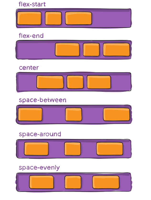
justify-content
justify-content 决定了 flex items 在 main axis 上的对齐方式
- flex-start(默认值):与 main start 对齐
- flex-end:与 main end 对齐
- center:居中对齐
- space-between:
- flex items 之间的距离相等
- 与 main start、main end两端对齐
- space-around:
- flex items 之间的距离相等
- flex items 与 main start、main end 之间的距离是 flex items 之间距离的一半
- space-evenly:
- flex items 之间的距离相等
- flex items 与 main start、main end 之间的距离 等于 flex items 之间的距离
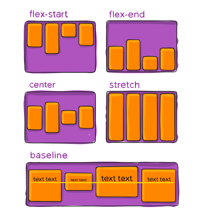
align-item
align-items 决定了 flex items 在 cross axis 上的对齐方式
- normal:在弹性布局中,效果和stretch一样 (高度必须是auto,或者没设置就是auto)
- stretch:当 flex items 在 cross axis 方向的 size 为 auto 时,会 自动拉伸至填充 flex container
- flex-start:与 cross start 对齐
- flex-end:与 cross end 对齐
- center:居中对齐 (常用)
- baseline:与基准线对齐